Last Updated on June 9, 2023
Wayfinding is unique in that it crosses into so many fields such as urban planning, architecture, marketing (i.e. through branding and steering behavior), and herein lies one of the problems that exist in so many places.
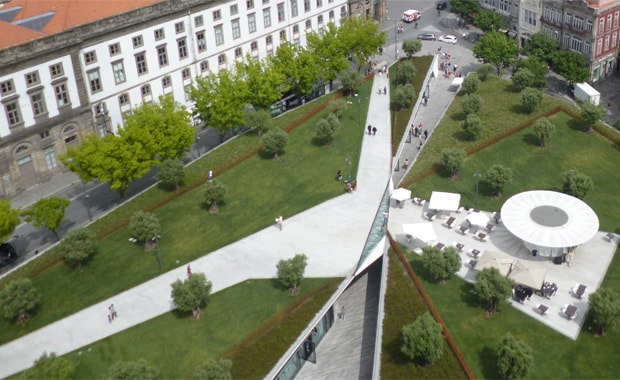
Architects are hired to design buildings and yet, as I am sure you will have experienced, so many brand new buildings, be it a new hospital, university campus or shopping mall, are so very often designed such that they have key wayfinding issues. Most commonly this is down to two reasons:
1. Wayfinding is not seen as a major part of the design from the beginning. A lot of the auditing we do are thus to fix existing locations i.e. to improve them for users.
2. When it is factored in, it is often seen in a disembodied style way. Imagine, for example, a signage system that is created and looks great and in theory would guide people perfectly.
Then put large numbers of people into the location and the system can fail because the embodied reality of how people move has not been factored into the design.
This is a very common problem, in that many architects are specialists in building design, but they are not experts in wayfinding.
The two areas quite clearly overlap but are two different areas of expertise. You would also not expect a wayfinding expert to be an architect.
Architects, nonetheless, have a key role to play in wayfinding systems design and there are a number of things that architects do very well and sometimes not very well when it comes to guiding people through and to different locations. Let us look below at some of the things architects can and do.
Table of Contents
Using Space to Guide People

The use of space is an invaluable tool in moving and directing people through medium and large size spaces and is especially useful when large numbers of users are involved.
Wayfinding is significantly more than the use of signage!
In larger areas such as urban centers (city centers), large airports, and large outdoor tourist attractions, as a few examples, the use of space can be particularly useful in wayfinding.
Large promenades (long and very wide streets) are a classic example of using space to make an area naturally attract people to walk a certain path.
Ever notice also in airports how the space in front of the security clearance area usually has a large wide space in front of it (in large airports)?
The idea is to draw you towards the area to get you through the security area and to the location where most of the commercial activity takes place.
Wayfinding, as you can see, is not just about helping to get you somewhere quickly and easily, but also is important for stakeholders in their efforts to make their location cost-effective.
The use of space in wayfinding can also be seen at main entrances to buildings. The space often draws you towards the entrance, whether you are aware of the focus or not.
You are naturally led to the entry point if the system for navigation is well-implemented and designed. It is not always the case of course, that the design is quite as effective as one might hope.
Use of Materials

Materials can be surprisingly useful in aiding the wayfinding process, and one example is shown in the photo above from Catania Fontanarossa Airport, with the use of glass.
By having large glass areas, this can be incredibly handy in making it possible for users to be able to see where they are going, where they are heading for.
In large indoor spaces such as shopping malls and airports, it is often possible to see quite distant locations which the user might be heading for.
This not only aids the mobility process in terms of helping users to understand where they are going and heading for, but it can also provide a sense of comfort to users.
Being able to see exactly where you are aiming for, helps to give users a more relaxed experience.
A wayfinding experience which is a relaxing and positive experience is essential for many locations because users are far more likely to return and re-use locations in which they had a good experience.
Many airport users, for example, are known to be especially loyal to certain airports, and this loyalty is not only according to available routes and proximity from one’s home.
Problems with Architects Designing for Wayfinding
One of the biggest reasons why so many new buildings are designed so poorly for navigating exists for a few reasons. They include:
1. No wayfinding expert is included in the process.
Too many architects believe themselves to be experts in wayfinding when they are in fact not. Wayfinding is a very specialized field of its own and, for the best projects, you need both an architect and a wayfinding expert working together.
2. Not enough effort is put into talking to the expected users and to really understand the needs of the users.
The need for qualitative research can be invaluable in the planning and in gaining a true understanding of what is needed in terms of wayfinding. This research though is so often overlooked and is an opportunity often missed and, as a result, can be costly in the long term.
3. A lack of appreciation, belief, and general acceptance of wayfinding as its own subject area is perhaps unsurprising in some respects, simply because wayfinding covers so many other areas of expertise.
In addition to architecture, wayfinding also crosses over into safety and security, branding, marketing, advertising etc.
It is not how people are moved and directed but also how they are directed to point of sale; how they are given a positive experience; how these movements can be managed such that the control and management of the process is in control of transportation companies, tour companies, attraction owners and so on.
For many architects, wayfinding simply seems to mean signage and the use of fonts, lettering, and design of symbols and icons.
Within the wayfinding discourse though, this simplistic concept of the field is an antiquated one but still resident in architecture in part.
Good Design for Architects and Wayfinding
There are of course some architects who have mastered a very high understanding of wayfinding and the use of design perfectly suits the movement of people and, in coming posts, I will be highlighting some of the best architectural designs from a wayfinding perspective, with some quite interesting case studies.
Dr Paul Symonds has a PhD in Wayfinding from Cardiff Metropolitan University in the UK. Paul works with the signage industry, airports and other locations providing wayfinding audits, consultancy and training.







Dear Paul,
Very well written! It was interesting to read your article, I totally agree with the wayfinding being misunderstood by architects – I am currently on a mission, trying to find ways to educate architects and clients in Croatia. Not the easiest task I must admit.
Regards,
Robert
Hi Paul, totally in agreement with your contentions in this article. I have been a practitioner in wayfinding & signage and am engaged in delivering a course on wayfinding titled ‘A sense of location’ to graduate Architecture students. However, few colleges recognize the importance and have included it in their programs. Somehow, the instant connect between wayfinding & signages – especially commercial signage ie advertising billboards etc – is so deep-rooted especially amongst traditional architects that the broader aspects of wayfinding in architectural design of public spaces is ignored and down-played. So, its an interesting effort now to convince more colleges to include wayfinding as at least an elective short course in their urban design programs. Your article is indeed timely and useful. Thanks.
Thanks Indrajit. Thanks for your comment.
Yep, this post went live 4 years ago so for sure something I’ve been saying for years.
Having been involved with academia it seems too difficult to get universities and colleges to understand how important wayfinding is in urban design,. They seem to just ignore it and hence why I think so many design mistakes are constantly made.