Last Updated on June 9, 2023
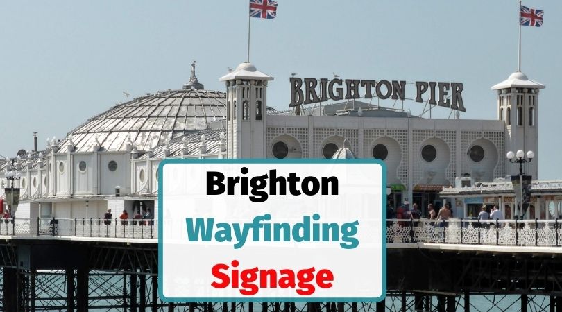
In every location I visit as I photograph, document and audit the local wayfinding system, I always find something either new, innovative or interesting.
Brighton wayfinding on the South-Coast of England proved also to be interesting.
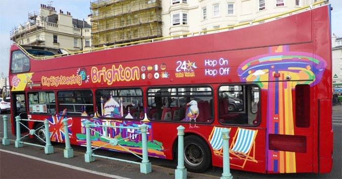
Seeing the bus routes painted onto the side of the Brighton buses certainly makes navigation far easier for users and user experience (UX) – see below.
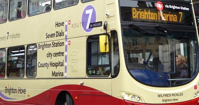
Indeed, navigating an urban area (city centre) should be effortless and such a simple technique makes wayfinding so much easier and yet such a useful way to help both local people and visitors are rarely used.
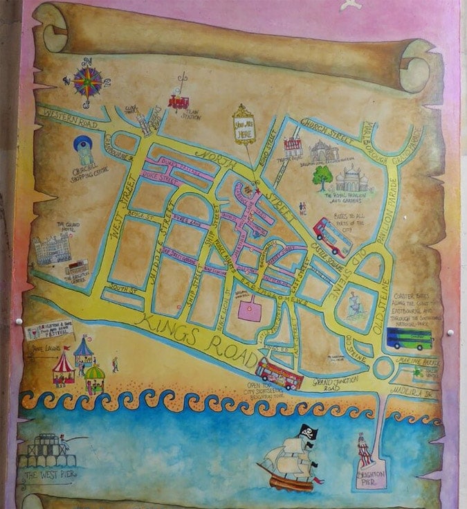
Table of Contents
The Interesting side of Brighton Wayfinding
The creative side of locals is often evident in Brighton and in one way it’s interesting to see wayfinding signage turned into a piece of art.
On the other hand, though, this is exactly what you do NOT want in wayfinding and one of the first lessons you should learn as a designer.
Standardisation, rather than creativity, is often much more important in creating signage that is clear across socio-cultural boundaries.
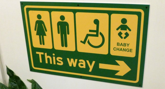
Take the standard toilet symbols, which are globally recognised. They work very well worldwide because we all recognise (or most of us anyway) these symbols.
Creating new symbols, which are artistic but not recognised en-masse, simply creates problems in wayfinding.
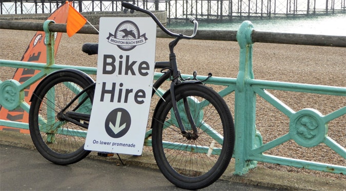
A number of artists do live in Brighton and this is reflected in part in the way creativity is used and another example is to be found on Brighton Pier.

Wayfinding is more than just guiding people. In urban design, for example, is also about the ‘experience’ of getting from A to B and how successful we are at this.
In designing a wayfinding system, the intention is not only to help to make it easy for people to find their way around a location but to do so in such a way that the person or people involved, also enjoy the experience and wish to return again.
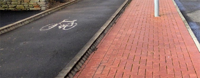
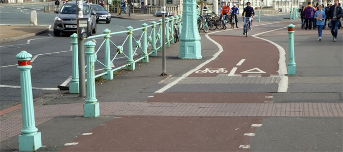
Creating an efficient local transportation system and network, making an urban area bicycle-friendly and pedestrian-friendly is important in the effective design when wayfinding is being considered.
Popping up in every major tourist location you will, these days, see a Hop-On, Hop-Off tours bus.
Personally, I love these tours because it is an extremely easy way to see a city and the standardisation of this product, from my experience, has been excellent in every location I have visited.
I have used these buses in Cadiz, Barcelona, London, Madeira and a bunch of places and they are a great way to see a city without getting lost.
You can get off of the bus and do some recreational wayfinding yourself and get lost, if you wish, and explore.
But having the Hop On Hop Off bus stops available as points at which to jump back on the bus and get transported to other main attractions or areas, makes it easy, if you are visiting a city for just half a day, such as if you are on a cruise stopover (not the case though when visiting Brighton of course).

Nothing defines a location more, I think than the entry point and, for those of you arriving in Brighton by coach, it is understandable why your first impression of the city might be very poor indeed if based on your arrival point.
Brighton coach station, in effect, is an uncovered area with a line of rubbish bins and a place for 2 or 3 coaches to stop (although quite convenient if you are staying in the YHA).
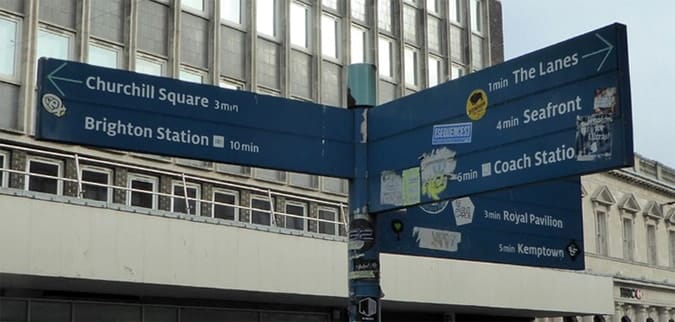
As a city that is popular with artists, close to London and considered an affluent city on the south coast of England, the state of the wayfinding system and urban design largely reflects the present state of the city and the lack of attention given by the local planners to the city centre area.
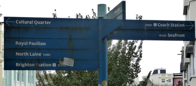
I travel to many cities in the UK and abroad and have photographed the wayfinding system in each of these, and Brighton is by far the worst in terms of its wayfinding system.
Brighton Narrative and Branding
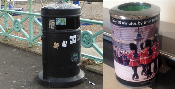
In terms of creating a wayfinding narrative, little effort also seems to have been given to creating any meaningful brand and the city seems to be suffering the same problems, which other traditional seaside locations around the UK have, such as Blackpool.
The introduction of mass airline travel in the 1970s and then of budget travel airfares in the 1990s and beyond has meant that travelling to coastal destinations in Spain, France and Portugal have become more popular, at the expense of British seaside towns.
Despite some stories seeing Brighton as a hipster city, one of the first things which will strike you, as you walk around the city centre, is the number of homeless men sleeping in the streets and the level of begging.
This is a city that has many problems and ironically the attention given to an urban wayfinding system and how well it is maintained or not, I have very often found reflects the city and urban area itself.
In the image above, even bins can be optimally used for creating a strong narrative and improving the urban wayfinding experience.
Such attention to detail separates those cities that embrace building a narrative and caring about the visitor and local users experience.
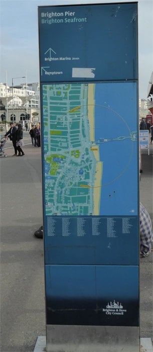
Three things immediately that need to be done are:
- Update and upgrade all directional signage in the city centre. Use one signage family and make the signs large and bold. A definite need exists for a new wayfinding system.
- Move the coach and bus station to be connected or next to the train station to create one powerful hub and entry point to create a much greater first impression for those arriving into the city.
- Take signage maintenance seriously.
Brighton is Actually a Nice City
There is actually a lot to see and do in Brighton and it is a city I would recommend visiting, despite the sheer lack of effort, money and attention given to maintaining the city centre areas and towards placating visitors.

Dr Paul Symonds has a PhD in Wayfinding from Cardiff Metropolitan University in the UK. Paul works with the signage industry, airports and other locations providing wayfinding audits, consultancy and training.


