Last Updated on June 9, 2023
As one of the busiest airports in the UK, Gatwick Airport is an excellent case study in the first of our series on travel locations and transient spaces and how wayfinding is tackled in these locations. In this post, a look at Gatwick Airport wayfinding.

Wayfinding is of course not specific to the tourism industry but what we can learn from how this industry sector tackles this field of study, can be invaluable for wayfinding in all sectors of business.
Tourism is a sector that generates significant revenue from these tourism spaces and for which the flow of people tends to be vital both for safety, security and for pleasure.
Airports offer us an interesting insight into some of the ideas that help us to guide people through what are massive spaces.
The implications for effective people movement in such a location in vital.
Table of Contents
Simplicity, Navigation and Wayfinding
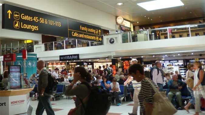
Some of the simplest of ideas are sometimes the most helpful and the concept of what I personally like to call ‘Comfortational Signs’ are often some of the most effective.
In crowd management and mass movement, providing simple and easy to understand information can have a two-fold effect
- You are providing comfort signs which aid the overall experience of a traveller in that there is a certain cognitive value sub-consciously, in knowing how you are progressing in transit.
- Moving through an airport can be a stressful experience for groups such as the elderly or those travelling with children and these types of signs provide a sense of comfort. Comfortational signs make navigating through such a tourist space much easier to plan.

Airports are challenging places to plan especially when one factors in the politics of the tourism space.
There are competing needs with the following all requiring different things in terms of the signage:
- Vendors
- Airlines
- the airport authority
- Security and safety services
- and the other stakeholders such as the airport owner/s
Considering the number of parties involved, the competition for signage space becomes clear.

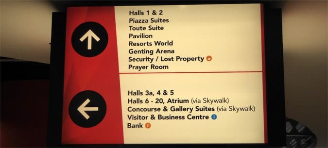
One sign which is a classic for causing confusion is the upward arrow.
This can sometimes mean going up a level and at other times, walking straight ahead. Which of these two meanings the upward arrow refers to is sometimes straightforward to understand when for example the signage is placed directly beside the stairs or escalator.
At other times when such a sign is not placed well enough, the meaning can be somewhat of a puzzle.

Stakeholder Politics
When we further look at the politics of semiotics and the way in which the stakeholders in an airport impact on signage, we begin to see how there is a crossover in how wayfinding information can be cross-matched with stakeholders.
A simple example above shows for example how flight information boards are actually placed inside one of the restaurants in Gatwick Airport.
This simple idea means that a stakeholder (in this case one of the vendors) can still increase their income whilst passengers still have access to the informational resources they need.
Take the flight information board out of the restaurant and there is a very good chance that passengers will spend less time in the restaurant.
Such a simple and yet innocuous concept perfectly matches signage with stakeholder needs.

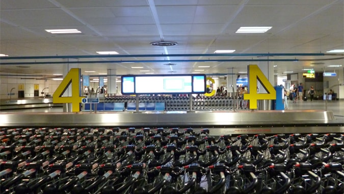
Travellers tend to be tired and weary when arriving in a new destination when they have just landed.
Add onto this the stress that many of us subconsciously experience in unknown places and one can begin to appreciate how size can add clarity and comfort to a traveller.
Gatwick Airport’s use of very large numbers to signify the baggage claim carousels leaves little room for confusion.

Look in any direction in Gatwick North or South Terminals and you will see information detailing something whether it be directional, informational or confirmational.
There are so many signs to read and to take in that our minds are very selective in choosing which ones to read.
This makes the job of a wayfinding expert a challenge in that the right priority, position, size and colour needs to be given to the right signs.
One wonders if some information that is displayed at an airport really is information overload?
Brand awareness and making one’s ethics clear to passengers is important but at the same time, will anyone really read the ‘How are we performing’ notice boards at Gatwick North Terminal?

Comparison

It is hard to fully appreciate the efforts of Gatwick without comparing it against other airports.
Taking a look for example at Catania Airport in Sicily, it makes one appreciate how much effort has been put into wayfinding and signage design and implementation in London.
One might say that we are comparing a very large versus medium-sized airport (although Catania Fontanarossa airport) is one of the busiest in Italy domestically).
Gatwick is much larger but then comparatively speaking, their expenditure is also larger.
Catania airport (at least at the time of writing) offers much more basic and colourless signage and somewhat more confusing use of information – see our page on Sicily including the airport).
Gatwick though has spent a lot of money on trying to help travellers navigate the two terminals, parking and other areas around the airport, with over £1.5 million sterling spent on improving the wayfinding in the last few years.
There is always of course room for further improvement, but it is great to see an airport making efforts to improve the experience of their customers.
Dr Paul Symonds has a PhD in Wayfinding from Cardiff Metropolitan University in the UK. Paul works with the signage industry, airports and other locations providing wayfinding audits, consultancy and training.

