Last Updated on June 19, 2024
In charge of guiding people in a location and need to know more about developing a Wayfinding Strategy?
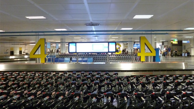
There is an art to guiding users, whether it be guiding them through an airport, a university campus, along a bay trail, through an urban area, shopping mall, country path or any other space.
Table of Contents
Use Props as Part of a Wayfinding Strategy
Wayfinding can easily be misinterpreted as an activity that only involves static locations, whether it be an indoor or outside location and space.
You might be navigating through an airport (a static indoor space) or on a countryside walk (static outdoor space), but the constraints within which we must navigate can be mobile and moveable.
Consider the situation, for example, where we are moving as part of a tour group or where we are directing new students around a university campus to try and show them around.
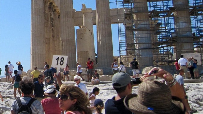
A good wayfinding system needs to include signage which sometimes can be mobile, to move with the people who must use the system.
Sometimes the solutions are both simple and cheap and need no complexity.
A classic example is used by tour guides who use numbered signs which they have placed on top of a large pole, as shown on a tour I did of Athens, in the photo above.
Less is More – De-Clutter
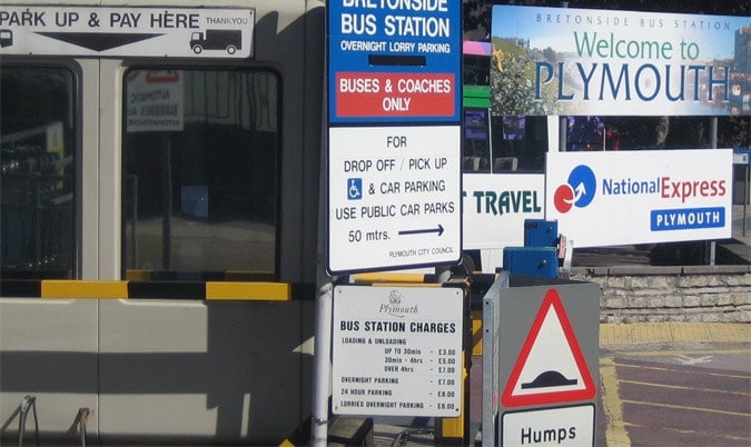
Wayfinding is not about adding more signage to direct and guide people, to aid their navigation.
Very often less signage creates a better wayfinding system.
By de-cluttering and by avoiding the clustering of signage, you can create a much clearer and easy-to-use the opportunity to improve the wayfinding effectiveness.
Consider, for example, removing any signs if they are really not needed and try to simplify where it is possible to do so.
Think about using space, lighting, and other techniques for guiding and directing people (some of these ideas are explained further below).
Maintenance
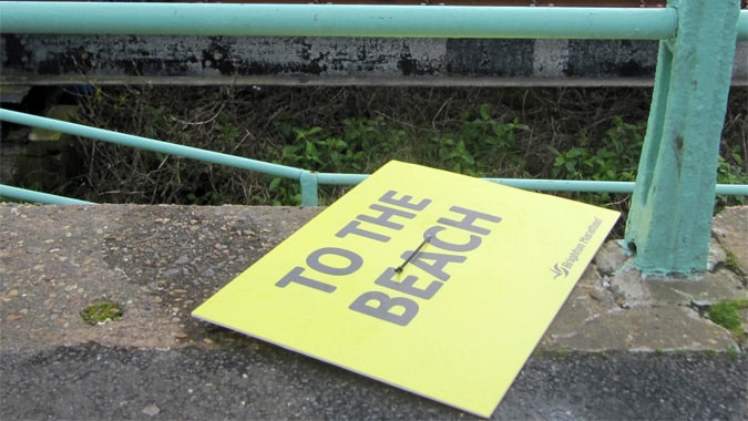
It might seem obvious, but for any of you who have read my previous posts such as on hospital wayfinding, you will probably appreciate that it is not uncommon for signage and other parts of wayfinding systems to be left un-maintained and for parts to become all but totally ineffective.
For any system to be effective for those who need to navigate the location or space in question, it is essential you have in place a plan for maintenance.
Documentation and Wayfinding Strategy
One of the easiest ways to maintain your system is to create a database of all parts of the system.
If you are managing an airport, for example, documenting every individual piece of signage is a good starting point!
Include information on:
- When the signage was last checked
- The general condition, the type it is
- and in what area it is located.
What you will find is that by keeping a database and documenting the system as an ongoing concern, it becomes much easier and more efficient overall to maintain the system.

Use Horizontal Signage
The Swedish furniture chain Ikea are masters at wayfinding, in that they guide people around their stores to maximise their chance to guide you towards viewing a lot of their products.
Trying to find your way out of an Ikea store on the other hand is not so simple.
The point is that wayfinding systems are not designed purely for the sake of providing users with the easiest routes.
Those of you who have gone through Bristol Airport, in England, will have noticed how getting from past the security checks area to the departure gates is not easy.
You are forced to walk through the duty-free shop whilst sales assistants thrust perfumes in your face.
Sorry – where was I – horizontal signage – consider making use of floors and the use of horizontal signage in order to make some systems much clearer.
Do think very carefully though, about the people who have to navigate your location and if they will be able to see the signage (see next point).
Accommodating all Visibility Levels
Horizontal signage or signage that is too distant for those who will view it can be problematic.
Consider also ‘You are here’ maps i.e. signage which you can view very close-up, often means that there is no space for more than one or two people to look close-up at the information at one time.
What can be more problematic even further though, is failing to consider the fact that many people have visibility issues and up to ten percent of the population can fit into this category.
Do consider all users in terms of visibility and what alternative aids you can offer, including, for example, tactile paving and audio guidance.
Signs and Signage Height
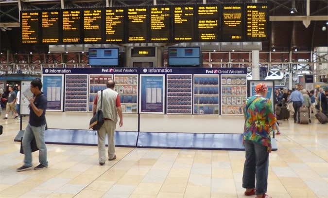
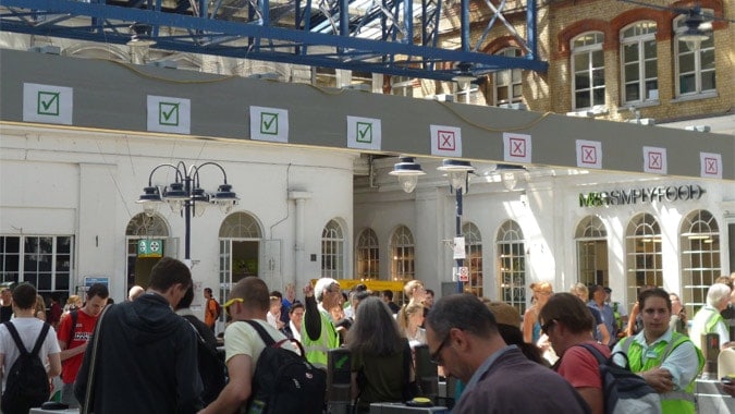
Also, give careful consideration to the height of signage.
Even for those with good visibility, the height has to be correct for practical use and also to accommodate the number of people who need to see the information, at the same time (as mentioned in the potential problem above with YAH (You Are Here) maps.
Think carefully about users’ needs.
Lighting
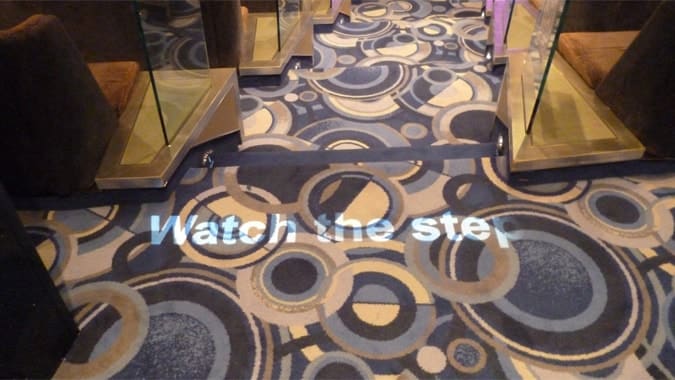
The use of lighting can be very effective as a guidance mechanism and also can be used as a temporary option when needed.
Where space is limited, this option can be particularly helpful. The lighted sign below was taken on the P&O cruise ship Arcadia in the theatre.
Design of Space
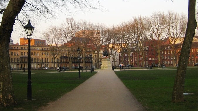
Design a location well and you might find that you need very little signage at all, because the design of the space itself guides users.
The use of paths through green areas with a central point and marked by a central landmark can be effective as one simple example (see image below).
Color Coding
Another useful way to keep areas uncluttered with signage and to offer another option for guiding users along certain routes and paths is via the use of color coding.
This form of aid is particularly helpful in helping to overcome issues of jargon and misunderstanding due to terminology.
In hospitals, for example, the use of medical names and terms can make finding some destinations especially confusing.
Trying to find the green building by following the green lines though can be much easier.
That is though until the department moves as can happen. So color coding can work well but as part of a well-designed strategy.
Decision Points
Think carefully about where the decision points are.
It makes little sense, for example, to plan a ‘You are Here’ map in a place where few people will notice it.
It makes little sense also to have directional signage which is placed after the point at which people have to make the decision when coming to a place where they may have 2 or 3 path options.
Dr Paul Symonds has a PhD in Wayfinding from Cardiff Metropolitan University in the UK. Paul works with the signage industry, airports and other locations providing wayfinding audits, consultancy and training.

