Last Updated on June 12, 2023
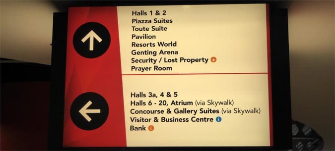
One of the biggest challenges facing wayfinding designers is trying to cater for the wide variety of languages and the use of multi-lingual signage.
An airport such as Heathrow Airport in London, for example, with over 200,000 passengers each day, can expect to cater to passengers who speak over 100 languages or more.
Trying to thus cater for such a wide range of cultures and languages can be complex. There are a number of solutions for overcoming these challenges as are discussed below.

Table of Contents
Driving and Reading Multi-lingual Signage
A common problem I see when people are designing multi-lingual signage, particularly in airports, is the decisions and planning for trying to cater for two different languages.
This problem exists in many wayfinding locations, including urban centres, but is especially common as a problem in international airports.
Symonds (2016)
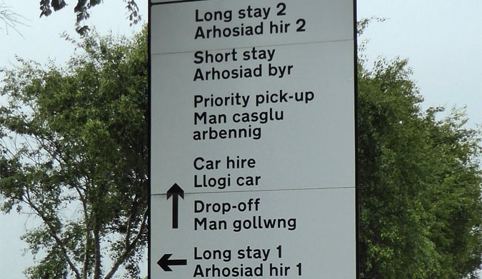
When driving into one of these airports, having all of the signs in the same colour, font and size, means that drivers have a very real problem reading the sign quickly enough in order to gather the information they need.
In certain locations, such as airports, the users are also often unfamiliar with the location and also often in a different from a normal state of mind because, for example, the person is off on holiday or thinking about a business trip, or preparing to meet a relative.
Colour (Color) Coding for Dual-Language Signage
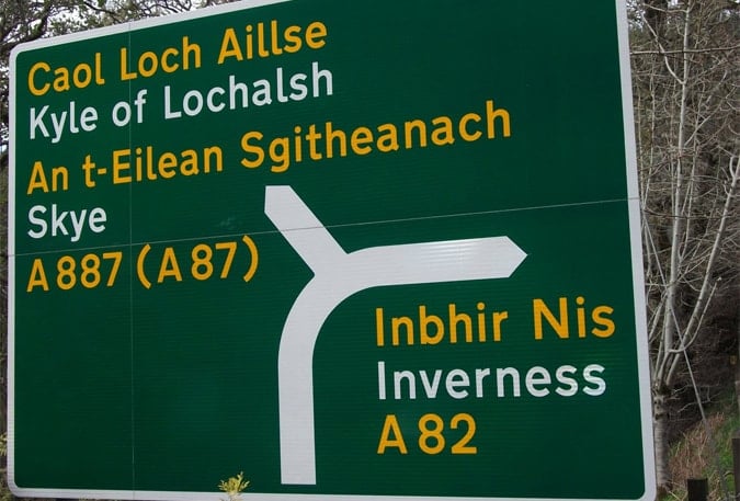
Colour coding is a great solution to solve many wayfinding issues associated with multiple languages.
In the same way, the colours and visual identification of a national flag can be used to steer people towards specific language signs and information, colours can also be used to differentiate languages, such as on road signage.
The cognitive process immediately becomes a far easier one, once you only have to be aware of one colour. Signage that makes the two languages distinct from each other is such an obvious idea perhaps, that it is surprising that it is so often ignored.
International Visitors and Signage for different Languages
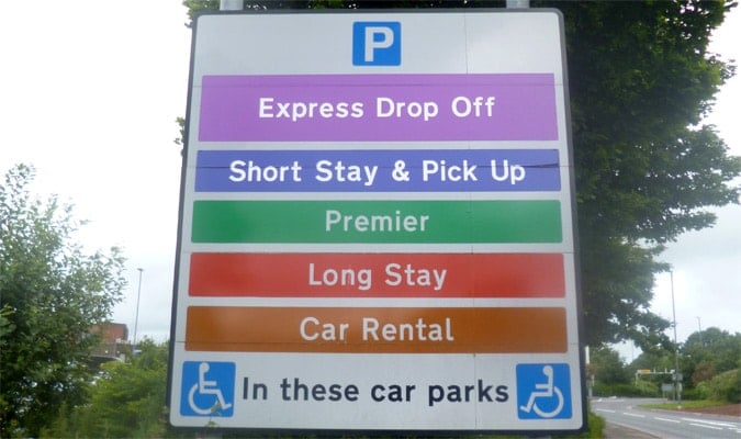
Another use of colour coding to help language problems is shown above in an example whereby each parking area, within Bristol Airport, is colour coded.
The colour coding also helps passengers to remember which parking area they need to use, but also helps passengers to identify the information they need much quicker.
The benefits of this type of colour coding can though help those who use different languages, thus colour coding is an extremely useful tool in wayfinding design for a number of reasons.
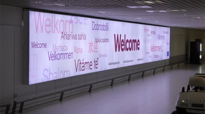
Whilst the above piece of signage is a static rather than a digital sign, you can make use of digital signage to specifically target languages to provide specific information to specific passengers at given times.
If you have a number of flights coming into your airport at a specific time, you can, for example, provide wayfinding directions (icons and language) in one or more dialects for those specific passengers.
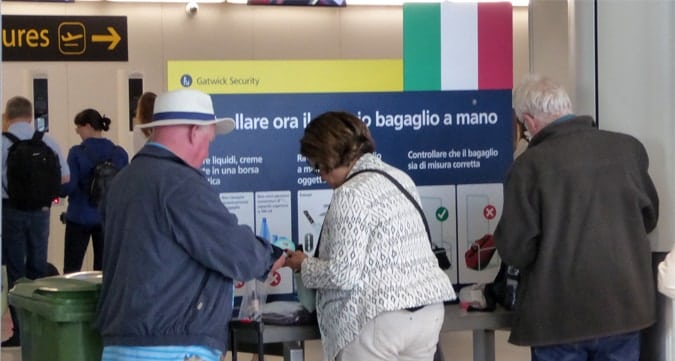
Later on, a flight coming in from Italy with a high percentage of Italian speakers can be signed in Italian.
Digital signage in this respect provides a new opportunity to provide more targeted wayfinding information.
Using Icons or Pictographs on Wayfinding Signage
Making use of icons is a wonderful way to greatly reduce language issues BUT provided you stick with the most internationally recognised symbols.
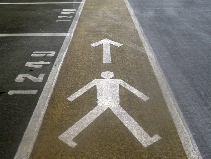
One problem is that designers love to design i.e. they love to try and make new icons and new symbols to try to impress. And the big problem is that these newly designed logos that designers like to come up with are often not as clear as they need to be. Simplicity is the key.

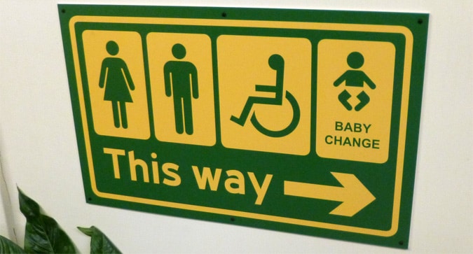
Where possible, try to use icons such as the traditional man, woman and wheelchair to signify toilets.
A further issue also is that many of the standard pictographs, such as those listed in the ISO catalogues are perhaps what many of us will say are common-sense signs, meaning obvious.
But what is obvious? When we factor in disability acts such as DDA and ADA, then we need to think of both physical and mental dis/abilities and design.
Some people will simply not understand what the image represents or will not see the image clearly.
We also need to think in terms of universal design if a location will have international visitors.
So we need to combine dis/ability considerations, with universal design.
Multi-Lingual and Language Design Tips
So my tips on designing signs and signage for busy locations where there is a lot of footfall (many people) and where you also want to consider legislation such as the DDA and ADA (disability acts) is to:
1. Start by de-cluttering signs by removing text that really does not need to be on the sign. Is there, for example, an easier way to say something?
2. Do consider hierarchy on signage. You do not, for example, need to signal the luggage or baggage collection area and the parking area on the same sign. People need to park their car before then using the luggage area so they would rarely belong on the same sign.
3. Do be consistent though on using the same naming conventions on all of your signs. If you can something a ‘toilet’ on one sign, ‘then do not call it a ‘restroom’ on another sign.
4. Use icons to reduce text but do also consider that different users use varying learning and comprehension styles. In line with making signs as clear as possible for those with a disability, pictographs and text can be a good solution. Use them together.
5. So to reduce text on signs (especially for those that will be multi-lingual and language), and use internationally known pictographs or symbols.
6. I would then suggest text to accompany the pictograph but with the text colour coded accordingly so that each language is always shown in one colour text/background so that most users (those not colour-blind) know exactly what colour to look at without having to think much about it. We are bombarded with signs everywhere so anything that aids the cognitive experience is a positive.
7. Colour coding can be very helpful as long as it is not the sole technique used. A percentage of people are colour-blind and will not understand the system.
8. Make sure signs are maintained. Have a signage rota to have signs checked monthly and repainted or remade as needed.
Dr Paul Symonds has a PhD in Wayfinding from Cardiff Metropolitan University in the UK. Paul works with the signage industry, airports and other locations providing wayfinding audits, consultancy and training.

