Last Updated on June 19, 2024
There are a number of techniques for improving urban navigation design, that can be used for helping people find their way. In this post, we look at urban navigation design and highlight some solutions that you might find interesting.
Implementing a wayfinding strategy, one of the biggest concerns faced by the majority of decision-makers such as those at the management level, is whether or not to allocate any budget to a strategy which by many, seems to be immeasurable.
The common thought is that it is hard to allocate money and time resources to something which cannot be proven to be effective at the boardroom level. Wayfinding is measurable but more about that in a coming post.
Even if you do allocate a budget to improving the wayfinding though, not every technique you can use is that expensive relatively speaking.
Some techniques, in fact, are quite clearly very inexpensive and surprisingly effective and so let me explain some such techniques that are used in urban wayfinding for city visitors.
Table of Contents
Pavement (Sidewalk) Painted Directions

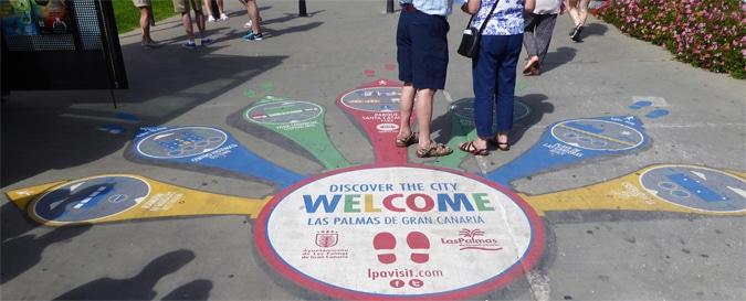
The city of Las Palmas uses a very simple idea for cruise passengers who flood the area by their thousands (see the two images above).
Knowing where to look for directions when arriving at a key decision point is not always easy as you move in large numbers.
The ‘Discover the City’ wayfinding directions, which are painted onto the ground in Las Palmas, provide details of the 7 main routes, with distance and projected walking time also included in the graphic.
On a recent visit to this area, this unique graphic was used by a majority of the cruisers who approached it in the ten-minute period when I observed its effectiveness.
The one downside is that maintenance becomes vital with such wayfinding tools, i.e. repainting is essential every few months, although, once the casts are made for the graphic, repainting or respraying costs should be very minimal.
Thin Blue Line – A Simple Solution in Urban Navigation Design

The ‘walking line’ that one can follow is not new, in that you can sometimes see this technique used in coach and train stations, airports and hospitals and it can sometimes be effective but also sometimes can be problematic.
In a location such as Tenerife, in the Canary Islands, where there is one definite but long route that large numbers of people need to walk, one long painted line can be surprisingly effective.
In this case, it takes you from the cruise port to the main square.
The long blue line, which tourists can follow, tends to be very significantly cheaper, cost and time-wise, than designing, manufacturing and installing what otherwise would require a dozen or so signs.
Wayfinding can sometimes be so simple and cost-effective, even if not always pretty.
Once again, maintenance is the key to making this form of wayfinding system effective.
Floor signage as a technique is not always so effective for two key reasons:
1. The materials used
paint or spray paint, provided it is re-finished every so often, can be a clean way to make the route.
This though is not always a good solution, such as for routes that are likely to change, and would thus mean a significant cost for removing the paint. For permanent routes, paint can work well.
In some train stations (such as Victoria Coach Station in London), coloured tape has been used.
This is effective but once again, only provided the tape is fixed as it tears up as people walk on it (something which happens often).
Coloured tape though provides a better short-term solution for changeable routes i.e. routes that might change every so often.
2. The type of location
A long single location such as the one used and shown below works very effectively with little room for confusion (as long as there are no breaks in the line i.e. any missing parts).
This technique used in Tenerife cruise port works very well. In a crowded indoor environment though, such as a hospital, this technique can sometimes create as much confusion for users as it helps users.
In an environment whereby departments can often change, i.e. the destinations are prone to change frequently, this technique can fail.


Working with Local Transportation Providers

As an urban area or city centre, franchises such as ‘CitySightseeing‘ and ‘YellowBus Tours‘ (although mostly in Portugal and Spain) are options for you if you are in charge of planning for visiting tourists.
Sometimes franchising out the opportunity offers you a relatively simple and cost-effective solution from your budgetary point of view.
There is a debate as to whether the service should be provided locally by a local business, but the global branding of city sightseeing makes marketing your city tour by bus quite easy.
When you consider that local drivers and ticket agents will be used, this is a worthwhile option.
The cost of a strong wayfinding system does not always need to be at the expense of local city spending!
Tourist Information Centers

How hard is it really to begin to place tourist information booths and centres where you can actually find them? Why do so many urban centres place them in often hard-to-find locations?
I remember a visit to Catania, Sicily, a few years ago, a place at the time where finding the tourist information was all but impossible, the office placed away from the centre and such that, if you could find the office then you would not need tourist information help anymore, given you would already be finding your way around.
I quite like the ‘City Expert’ Kiosk booth in Tenerife, Spain, for two quite simple reasons. One, it is actually placed right in the middle of the main pedestrianized walkways.
Many cities do have a centre close to where cruise travellers exit, but they are not always obvious, i.e. without the blue and white global colours used for tourist information and with no clue to non-local language speakers that it is indeed a tourist information point.
Having small booths in key decision-point locations simply makes sense and, once again, is a highly effective and inexpensive option.
One wonders why hospitals do not have one or two help areas within the grounds, using the same basic concept, especially in very large hospitals.
Using other Resources such as Bus Stops

Using other resources, which are in prime tourist areas, can be worth considering and the example used by Vigo, Spain, is a very simple idea but yet so incredibly handy as you arrive in the port area.
Using bus stops and advertising space such as shown above can mean a wonderful opportunity to improve the visitor’s experience at a minimal cost.
Wayfinding, as you may be aware, is more than just guiding people but also about branding, i.e. providing a very positive user experience.
The idea is that you want a person to pass on news of their positive experience to others.
Use of Space in Urban Navigation Design

The use of space is a vital tool in urban navigation design and can also be used to create a focal point for visitors.
A large pedestrianized and wide street can act as a wayfinding tool in its own right, in that the natural path or route to take is known, and without the need for any directions per se.
Residents Access

The balance in most cities is one of trying to make the place attractive and easy to navigate for tourists, but also a location that also satisfies commuters and those who live in there.
A very effective and often under-used technique is to use a parking access system such as used in Vigo city centre. Using car registration automated readers or passcards, bollard-activated access areas can be created.
Dr Paul Symonds has a PhD in Wayfinding from Cardiff Metropolitan University in the UK. Paul works with the signage industry, airports and other locations providing wayfinding audits, consultancy and training.

