Last Updated on June 12, 2023
Exactly what is a good wayfinding strategy is and best practice guidelines for developing and planning are discussed below!

It can really be quite overwhelming when you first start planning a wayfinding strategy, particularly if you are relatively new to the concept of wayfinding.
There is an infinite number of things to consider and factor in and there tends always to be a number of stakeholders who need to be considered and catered for.
For this reason, you are best starting off with a panel of people if the project is in any way sizable. This is discussed in more detail below.
Table of Contents
Getting Started
To get started, I would recommend bringing together all of those stakeholders who will be affected by the completed wayfinding design.
There is always a conflict of interests between different parties within any organization and, taking an airport as an example, there are the needs of the security team, health and safety, vendors, limousine service companies, and many others.
Just putting up signage to guide people is never enough for a wayfinding strategy.
One of the biggest mistakes made when planning for new buildings is to factor in wayfinding needs afterward.
Some buildings are so badly designed for usability, in terms of navigation, that the buildings become unused and close.
This, in fact, is exactly what happened with a shopping centre in the UK, with shoppers neglecting the mall because the layout was so confusing.
The shopping centre closed down only a few years after opening.
Understanding the Users’ Needs
No matter what you and others within your organization may feel is needed, it can be surprising how the users themselves will have views that are quite different.
It can be an extremely good idea to do a survey by interviewing those who use the travel space. Interview or survey those who will be the users for whom you are creating this new wayfinding strategy.
Data collection of this type need not be expensive. Do try and have a decent research plan in place though, i.e to try and interview a cross-section of different users and across different times of the day for example.
Users tend to already know the problems and many use the areas you are creating a wayfinding system for.
It can be worthwhile inviting one of these users onto the planning committee if practical to do so. You do though, at the same time, want to try and avoid too many voices in the planning.
Travel has changed dramatically, in the last few decades, with so many of us who work in the travel sector, also often users of the same or similar facilities to where we work.
Those who work in the travel industry, for example, will for the most part, also be travelers themselves. Those who work in the industry thus tend to often have valuable ideas worth also exploring.
The same exists for those who work in hospitals, universities, and other similarly large indoor spaces.
Do try and gather as much feedback as you possibly can in the time you have and with the budget you have.

Documentation – Efficient Wayfinding Strategies
Once you have established who the main people are who need consulting (so that their needs are at least considered), and once you have a committee to agree on all stages of the wayfinding strategy, you need also to think about the documentation of the strategy.
If you, for example, already have signage being used, do you have a record of what you have? Or do you have a plan in place for documenting all signage?
A travel hub which has, let us say, 300 signs of various shapes and sizes and providing different information, all need to be maintained, and they sometimes also need updating for information.
This becomes hard if you do not have a database of all the signage. In documenting the signage you have, try and group together sign types or group them by the area they are situated in.
Include information on the message/text which is on each sign, their condition, size, position, and the date when the sign was last checked.
Having someone maintain the signage once it is all in place, will become a vital part of your wayfinding strategy. Monthly checks can be a good idea.
Outdated and damaged signage is a classic reason for failing signage. Even using a Microsoft Excel spreadsheet can be sufficient for documenting signage in small travel spaces.
It is Not All about Signage
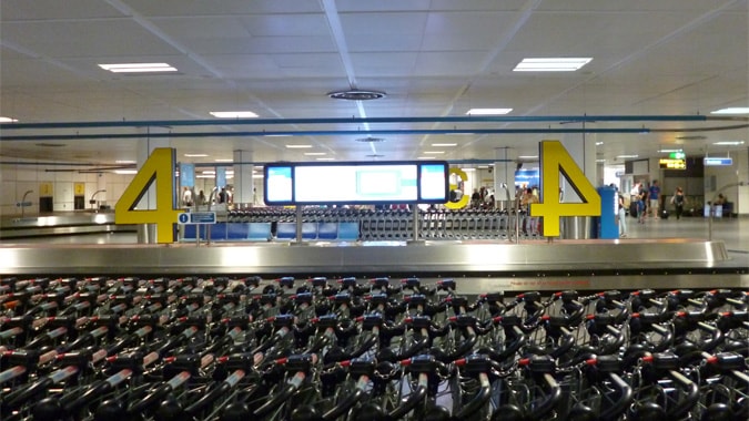
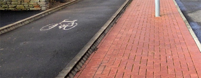
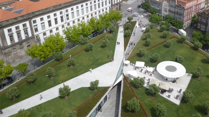
It is important to realize that not all wayfinding is about directional signage. Designers, architects, and those involved in managing our navigation through spaces including in urban areas, tourist attractions, hospitals, and other built areas, now realize that the use of space provides a great opportunity to also guide us (see the paths and use of space on the top photo for a great example of using paths and space).

Think carefully about where you really need signage and where you can use space and other features to signify entrance points for example.
Why spend on unneeded signage?
The use, for example in shrubbery, different materials such as glass or overhangs can all, where appropriate, be used to signify main entrances.
Considerations for What is a good Wayfinding Strategy
There are so many things to consider that this fairly basic check-list below, at least provides some of the main considerations to get you started:
Decision Points and Signage
You always want to ensure that signage is placed before or at decision locations and not after them.
Signage placed after key decision points can become redundant. As someone approaches a corner and has two choices of a path to take, having a sign which is visible already as the person approaches, gives them time to digest the options and this means good usability.
Visibility
Think about the visibility of any signage and how, for example, a wheelchair user might be able to view the signage.
Can it also be seen by those with poor sight and from a range of heights? This is where font size and font color become very important.
Think in terms of clarity and do not try to be too fanciful in the design, if it in any way compromises the clarity of the signs.
Signs should also be visible from all directions from which they can be approached.
Signs which are too low can also be accidentally blocked or hidden.
Lighting Signage
Connected to visibility, the lighting such as the background lighting directly behind a sign can be vital to get right.
Can people see the sign in indoor or dark environments?
Think carefully about the placement of signage.
Clustering and Signage
When signs you put up are competing for space with other signs, this is known as clustering. Other stakeholders will likely have different needs and this can become problematic.
This is one of the reasons why having a task force/group can help to avoid such problems because by working with all stakeholders, you have a better chance to influence them by their inclusion.
Those in charge of health and safety, security, etc. might well have needs that conflict and yet need to work in conjunction with others, to make improvements in wayfinding for the user experience.
Wayfinding, in essence, is as much about helping people to navigate in emergency situations as it is important in normal everyday situations.
Understandable Signage
So you have signage that is the correct height and clearly visible BUT can the signs actually be understood?
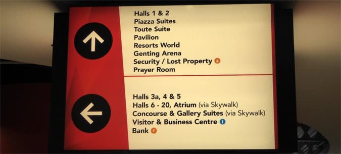
Do the words used in the signs actually make sense? Is the message simple and clear?
Do arrows clearly show the direction one should take?
Consistency and Conformity
In certain locations, users quite rightly will expect to see signage.
There are, in other words, logical places at which signage should often be placed.
If someone exits a lift, then when they step out, one would expect there to be signage facing them to guide them.
Consistency also needs to be remembered when it comes to numbering i.e. for rooms. It is essential that a logical sequence is used.
You will be surprised at how many locations ignore this basic rule.
For large buildings, consider combining the numbering convention with color-coding, for re-enforcement such as with a green zone and red zone etc.
Using People for Direction Giving and Finding
Using people as wayfinding aids and cues can be one of the most effective techniques.
The practicality of using human wayfinders as aids depends very much on your budget and the size of the space for which you are creating a strategy.
For a space such as an airport or hospital, it can be viable to have a person clearly marked as a helper, to be in the main areas through which they are navigating.
Some academic studies have shown that up to 15% of staff members’ time can be wasted by having to give directions and help people who are lost.
Multiply this by several staff members and you might decide that it is actually more cost-effective to create one role primarily based on customer service in the form of a human wayfinder!
Entry points
If users will arrive at your location, such as into car parks by car, make sure to consider signage that guides users to your location.
Wayfinding planning, in other words, is also about a seamless experience and thus not only about how they navigate your location but also about the smooth entry into and out of the location.
Disabled access
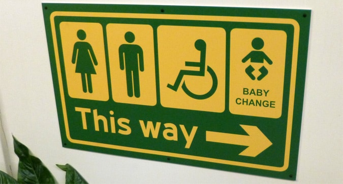
Do not forget to consider carefully those with disabilities (and DDA) and how they can navigate through your location.
Signage that helps disabled people, for example, needs to exist to help such people find lifts or special assistance help locations.
The use of automatic doors, appropriately designed pavements, and clear paths can also help.
Wayfinding, as you can see from this example, can be as much about what does NOT exist.
Make sure, for example, that nothing is blocking a route.

Not all Users have Good Sight!
So many wayfinding systems are designed with little consideration for those with poor sight and yet, up to 20% of the population is said to have some level of sight problem.
Those with blindness and who have sight problems, I would argue, have as much right to be catered for as anyone and thus try to make some provision for those in need. Not all aids which are used for blind people, for example, need to be expensive.
Think Simple to Understand – What is a Good Wayfinding Strategy
- Try and be consistent in the signage both in terms of colours, branding and positioning. Without consistency, signs can often create more confusion than they help (as you will see in the hospital wayfinding post).
- Languages – Think very carefully if considering using multilingual signs. It can make it very difficult to sometimes see the information that one needs, at a glance. Rules sometimes dictate that 2 languages must be used, but if you have the chance to enforce the use of one language only, I would strongly recommend to. Signage should be easy to read and not create confusion. In a city such as Cardiff, Wales, which would like to cater for international visitors, the use of Welsh in many signs simply complicates and dilutes the effectiveness of signage. Symbols and icons are a great way to overcome language issues and to keep signage simple.
- Windows and also the chance to see aerial views where this is practical can also provide users with a much clearer idea of the route which they must navigate. Being able to see the point towards which one is aiming for, makes the whole process that much easier.
- A fantastically easy way sometimes to also create a way to aid users of your facility or areas, is to create a landmark, which they can then use as a guidance mechanism. It might be a monument of some kind or even a water fountain that is visible from afar. Such an aid though can be incredibly effective as a guidance point and meeting point.
- Naming – Naming a library a learning center and confusing those who are looking for the library, or using uncommonly used words to describe a location can be unhelpful. Think carefully about all terminology used and think about simplification. Signage and wayfinding signs are not the time for marketing.

Going Digital
The idea of using digital technologies as part of a new wayfinding strategy can be overwhelming and confusing to start off.
What if the technologies do not work?
Technologies change so fast. Where do I start?
There are many questions and going digital, in the initial stages, can make the whole process far more complex and confusing.
On the other hand, going digital is the way forward and likely to become the way in which a lot of signage is used in the future.
Signage on parking area approaches can certainly benefit, with the signage able then to direct drivers to other car parks when one is full.
As per my experience in Gatwick Airport last Christmas though, when there is a power cut, chaos can be created when all electronic signage fails – and it does and can happen!
Do not be put off though in using digital signage or at least considering all of the options!
This is a large subject area and in coming posts, I will be explaining in detail all of the various options, so make sure to sign up to get the latest posts.
Checklist
- Bring together all stakeholders for a meeting.
- Document all signage that already exists.
- If at all possible, consult some of the users, Consider doing a survey or qualitative interviews with a number of the users.
- Identify and document the layout of the area which needs to be worked on and, where possible, get floor plans and maps of the area. Collate as much literature as will be useful.
- Plan the main routes which need to be developed, working out where key decision points will be.
- If you plan to use ‘people wayfinders’ as aids, create a training plan.
Dr Paul Symonds has a PhD in Wayfinding from Cardiff Metropolitan University in the UK. Paul works with the signage industry, airports and other locations providing wayfinding audits, consultancy and training.

